Untangling a state education site for six audiences.
The Maryland Higher Education Commission (MHEC) website served everyone from prospective students to state policymakers through a single, undifferentiated experience — buried in PDFs, duplicated content, and broken links. As a UX researcher on the redesign, I helped rebuild the information architecture around the people who actually use it.
Client
Maryland Higher Education Commission
Role
UX researcher
Methods
Content inventory, card sorting (n=30), SEO & competitor analysis, personas
Scope
Website & mobile app
Context
One website, six very different audiences.
MHEC is the State of Maryland's higher-education coordinating body. Its website is a front door for a remarkably broad set of people — each arriving with different goals, vocabulary, and levels of expertise.
When a single site tries to serve all of them the same way, no one is served well. A parent looking for financial aid, a policymaker looking for state data, and a university administrator filing a report shouldn't have to wade through each other's content to find their own.
Prospective & current students Parents & families Colleges & universities High-school counselors & educators State policymakers & officials Researchers & data analysts
Approach
Auditing the content, then asking users to sort it.
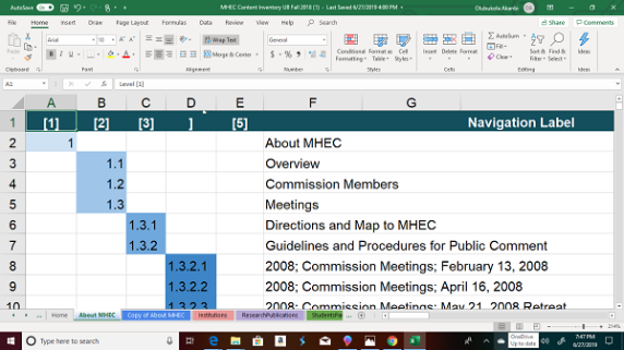
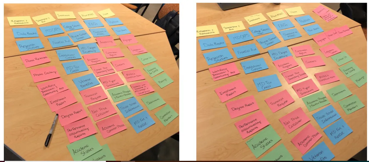
Before proposing anything, we needed to know what the site actually held and how real users expected it to be organised. The research combined a full content audit with hands-on input from thirty participants.
1
Content inventory
A full audit of existing pages, documents, and links to surface duplication, PDFs, and dead ends.
2
Open & card sorting · 30 users
Participants grouped and labelled content in their own words, revealing how each audience expects the site to be organised.
3
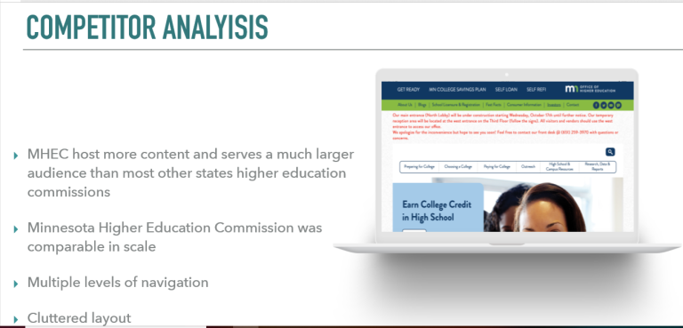
SEO & competitor analysis
Benchmarked discoverability and structure against peer state agencies to find gaps and opportunities.
4
Personas
Synthesised the audiences into clear personas so design decisions stayed anchored to real user needs.
Content inventory — auditing every page, document, and linkOpen & card sorting with 30 participantsCompetitor & SEO analysis against peer agencies
The problem
What the content inventory uncovered.
The audit surfaced a tangle of structural issues — most concentrated on the Research & Publications pages, where information that should have been browsable lived almost entirely inside documents.
Too many PDFs
Core information — especially across Research & Publications — was locked inside PDFs instead of living as accessible, searchable web pages.
Duplicated content
The same information appeared in multiple places, creating confusion about which version was current and authoritative.
Missing & broken links
Navigation paths led to dead ends, eroding trust and leaving users stranded mid-task.
Poor SEO & accessibility
Weak structure and document-heavy content hurt discoverability and made the site harder to use for everyone.
The insight
The root problem wasn't the content. It was the lack of separation.
Across every issue, one pattern stood out: the site made no distinction between its audiences. MHEC employees, students, parents, and faculty all funnelled through the same undifferentiated structure.
When a site serves everyone the same way, it serves no one well — each visitor has to dig through everyone else's content to find their own.
That reframed the brief. The redesign wasn't about restyling pages — it was about giving each audience a clear, dedicated path, and lifting information out of PDFs into pages people could actually find, read, and act on.
The redesign
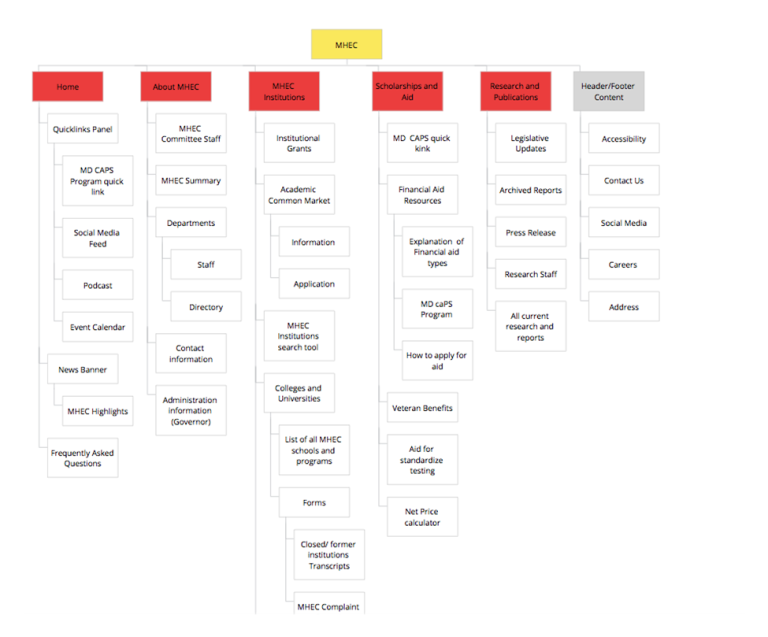
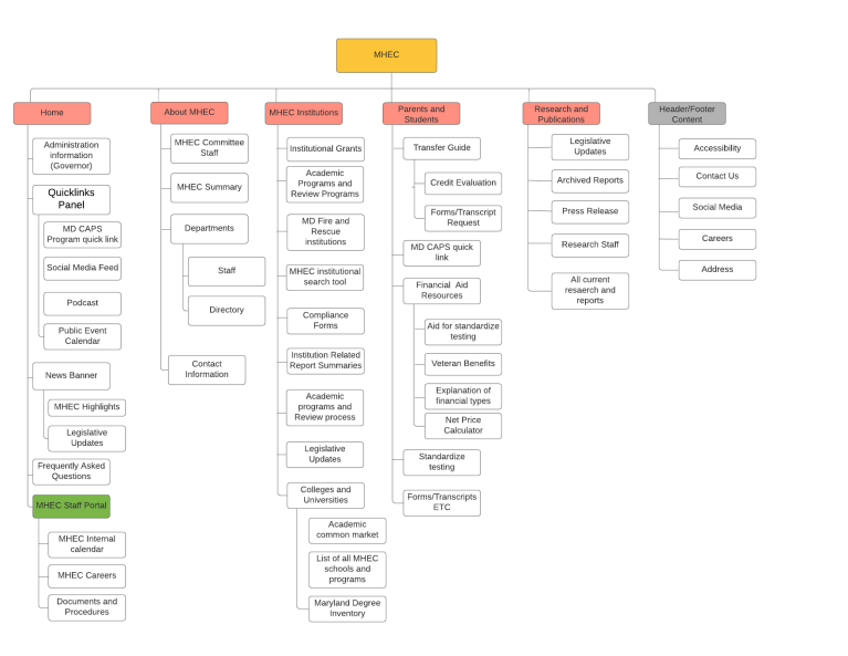
A new information architecture, built around people.
We proposed a restructured site map that leads with audience, surfaces the most common tasks, and replaces document dumps with real pages.
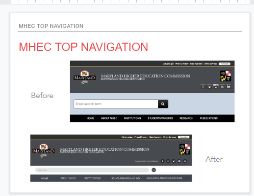
BeforeAfter
Top navigation — before and after
The proposed structure introduced a Parents & Students entry point, a Degree & School Search, a Highlights section, clear user separation by audience, and a shift toward more pages and fewer PDFs.
Separating the audiences
The cornerstone change: a clear entry point for each group, so visitors land in content built for them instead of sifting through everyone else's.
MHEC home
Students
Aid, programs, school search
Parents & families
Planning & paying for college
Institutions
Reporting & compliance
Policymakers
State data & policy
Researchers
Browsable data, not PDFs
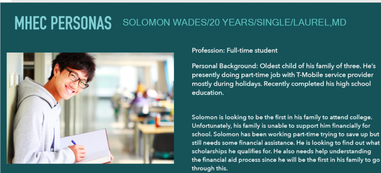
Anchored to personas
Personas kept every structural decision tied to real people and their goals.
Personas representing MHEC's key audiences
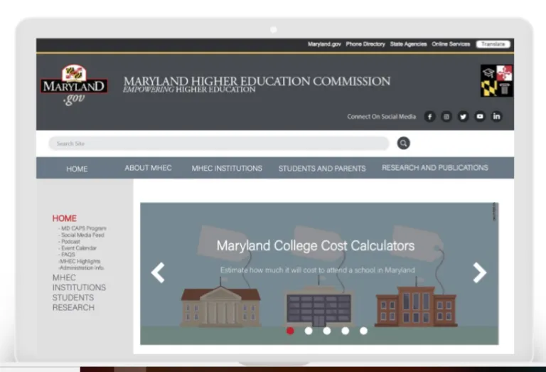
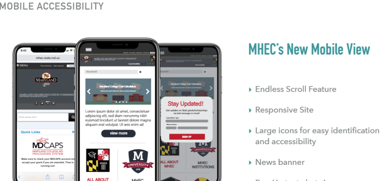
The redesigned experience
The new structure carried through to a refreshed homepage and a responsive mobile experience.
Redesigned MHEC homepageMobile experience
Outcome & reflection
The client chose the new direction.
We presented the redesign back to MHEC stakeholders, and they preferred it over the existing site — alongside a set of branding strategies to carry the new structure forward.
"So much better."
— MHEC stakeholder, on the proposed redesign
Audience-first IA
Each user group gets a dedicated path instead of one undifferentiated menu.
Pages over PDFs
Information lifted out of documents into accessible, searchable pages.
Stronger SEO & access
A cleaner structure improves discoverability and accessibility for everyone.
Branding strategies
Recommendations to give the refreshed site a consistent identity.
What I'd do next
The natural follow-up is tree testing and moderated usability testing on the new architecture to validate that each audience can complete its top tasks faster — turning the qualitative client preference into measured task-success gains.