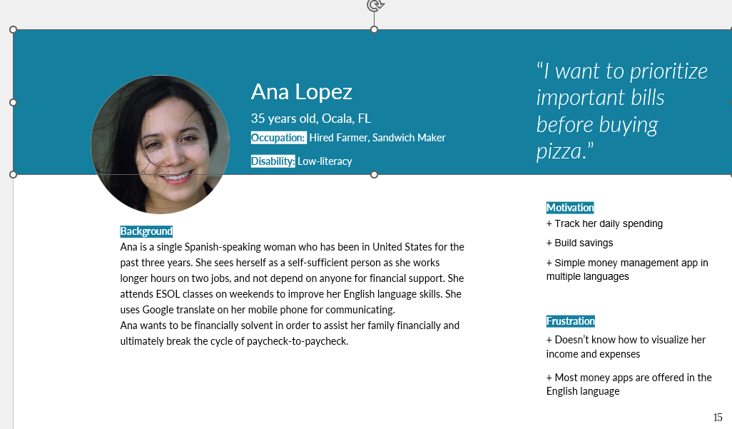
For many undocumented immigrants, budgeting feels complicated, time-consuming, and stressful — compounded by language barriers and real fears about digital privacy. Traveling Money is a concept app that reimagines budgeting for this community, grounded in research into how they actually think, feel, and perceive technology.
Undocumented immigrants face a plethora of challenges — and managing money is one of the most persistent. Poor communication options driven by language barriers make budgeting feel complicated, time-consuming, and stressful.
Designing for this community means more than translating an interface. It means understanding their fears, their priorities, and their relationship with technology — then designing something that earns their trust. That's where the research had to start.
Through user personas and a synthesis of the literature, we built an understanding of undocumented immigrants across three dimensions — each with direct design implications.
Poor communication options due to language barriers make budgeting a complicated, time-consuming, and stressful process.
Through trials and tribulations, family is what matters most — the lens through which money decisions are made.
There's constant tension between needing a smartphone and the privacy risks that come with the convenience it offers.
We synthesised the research into Ana: a 35-year-old, Spanish-speaking single woman in Ocala, FL, working two jobs and attending weekend ESOL classes. She relies on Google Translate to communicate and wants to break the paycheck-to-paycheck cycle and support her family.
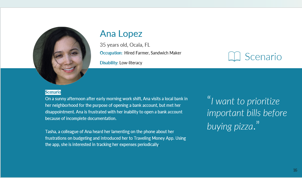
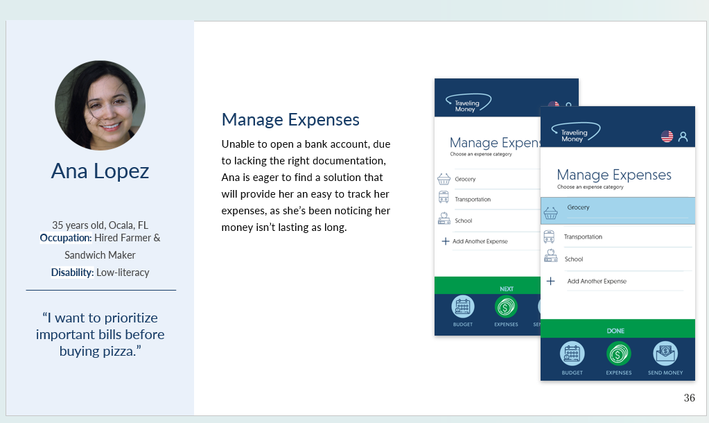
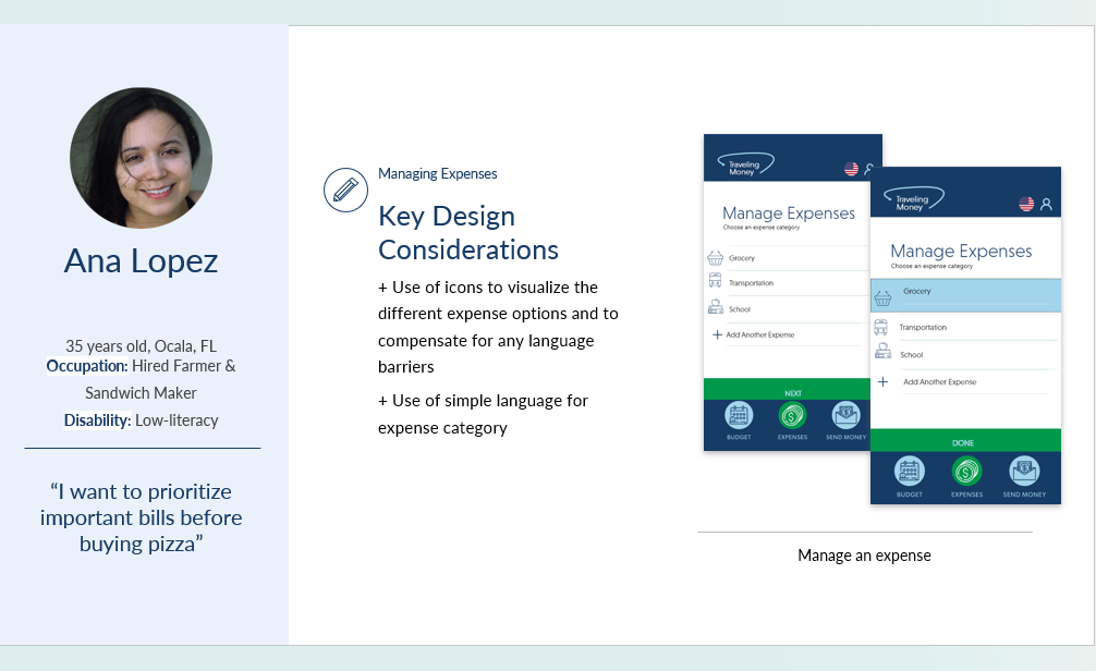
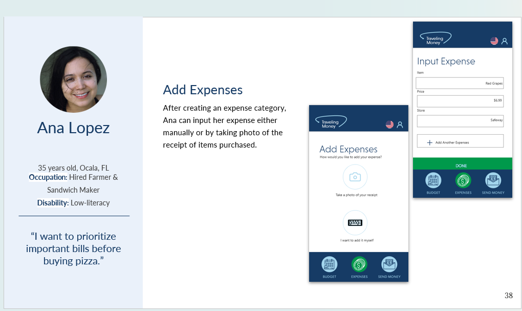
Her motivations — track daily spending, build savings, and have a simple money app in multiple languages — sat right alongside her frustrations: she didn't know how to visualise her income and expenses, and most money apps are English-only. A scenario brought her to life: after being unable to open a bank account due to incomplete documentation, a colleague introduced Ana to Traveling Money, and she began tracking her expenses.
"I want to prioritize important bills before buying pizza." — Ana Lopez


The characteristics translated into four "how might we" questions — and a design direction for each.
How will our app address digital privacy concerns?
Privacy-first design — minimise the personal data collected and reassure users their information is protected, easing the convenience-vs-risk tension.
How will we overcome the language barrier and create a seamless interface?
A visual, low-text interface with clear icons and language support, so the app is usable regardless of English fluency.
How will we remove the negative conceptions around budgeting and make it simple for those who are unfamiliar?
Simple, guided flows and friendly framing that turn budgeting from a stressful chore into an approachable, everyday task.
How will we incorporate financial literacy to improve the way undocumented immigrants make money decisions?
Built-in financial-literacy guidance woven into the experience, helping users make more confident money decisions over time.
Reaching undocumented participants directly carries real risk for them. So we grounded the work in personas and a careful synthesis of existing research — letting evidence, not assumptions, define the user.
Reviewed and synthesised existing research to understand the cognitive, social, and perceptual realities of undocumented immigrants.
Translated the research into personas that kept the team anchored to real needs, fears, and priorities.
Distilled the insights into four guiding "how might we" questions to focus the design.
Generated design directions and a prototype concept — Traveling Money — that answer each question.
Designing for a vulnerable, hard-to-reach community means leading with empathy and evidence — and treating privacy and dignity as features, not afterthoughts.
The prototype turns the four design questions into a real, icon-driven experience. A persistent bottom bar — Budget, Expenses, Send Money — keeps navigation simple, and a language toggle keeps it accessible.
Ana chooses an expense category — Grocery, Transportation, School — each paired with a clear icon so the app works regardless of reading level or language.

Two principles drove the screens: icons to visualise each expense option and compensate for language barriers, and simple language for every expense category.


To remove friction, Ana can add an expense two ways — snap a photo of the receipt, or enter it manually (item, price, store) — meeting her wherever she is.

Traveling Money shows how thoughtful, evidence-based research can shape technology for people who are too often left out of the design conversation — turning budgeting from a source of stress into a tool for stability.
The natural next step is to partner with community organisations to safely and ethically test the prototype with real users — validating the privacy approach, the visual interface, and the financial-literacy features with the people they're meant to serve.